The Break Room
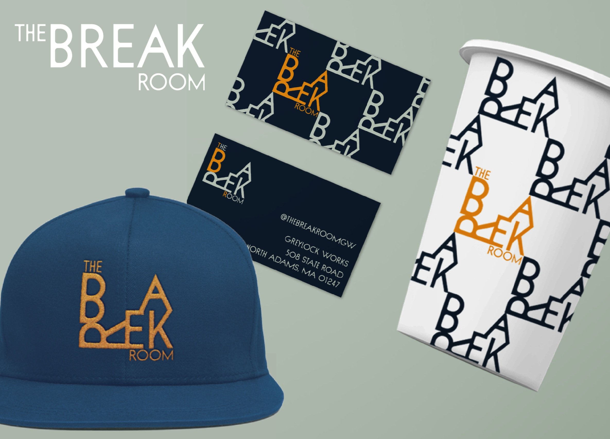
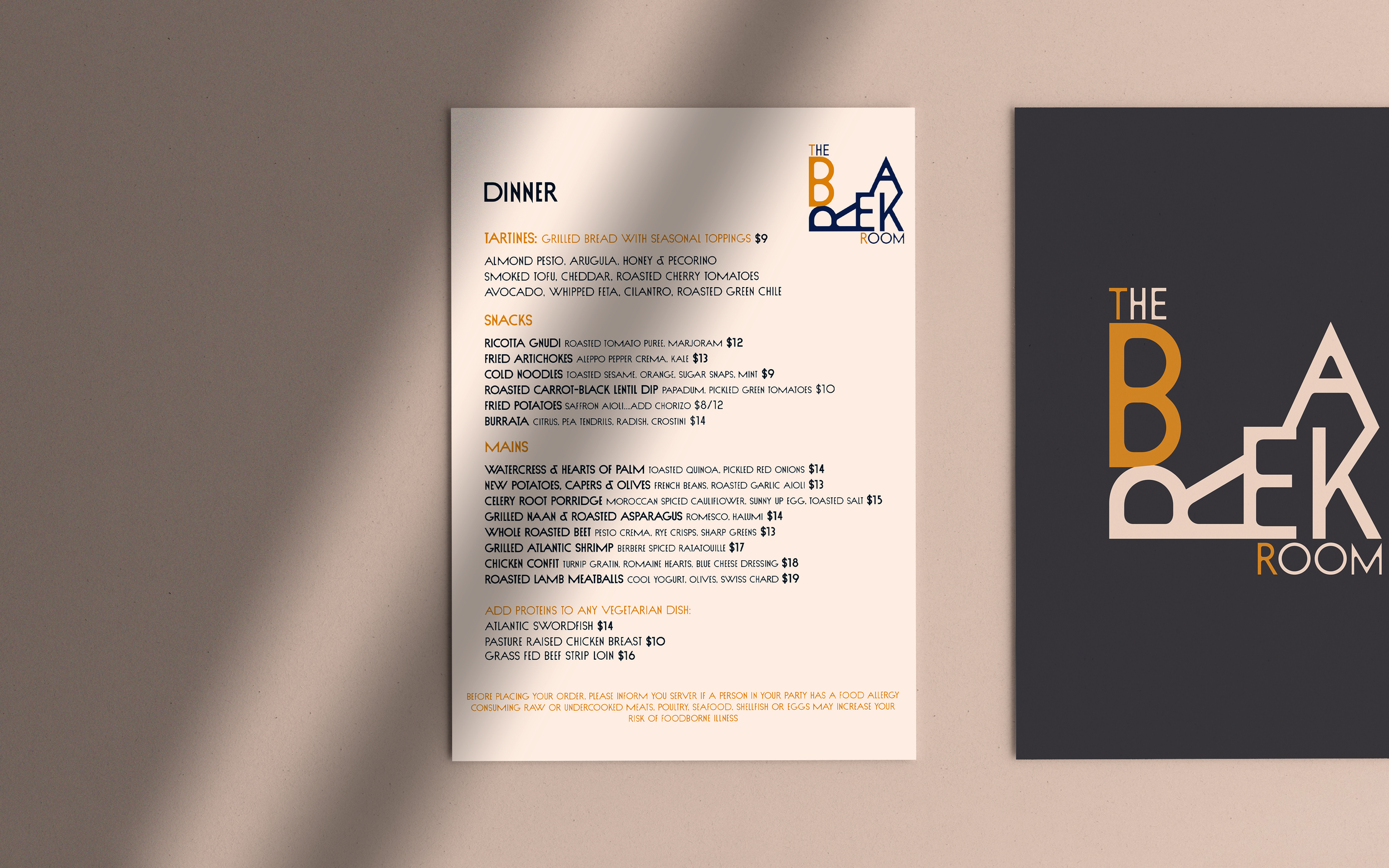
*Logo Design*Brand Identity*Visual Identity*Print Design*Product DesignInspired by the architecture of the Greylock WORKS building where the restaurant resides, The Break Room’s brand was born from the notion of ‘Architectural Typography’. The Greylock WORKS warehouse is an industrial mill complex turned into a communal hospitality space—“An oasis for sparking collaboration and innovation.” Along with The Break Room, the campus features a distillery, cidery, culinary lab, co-working space, events space, and LOFT living.
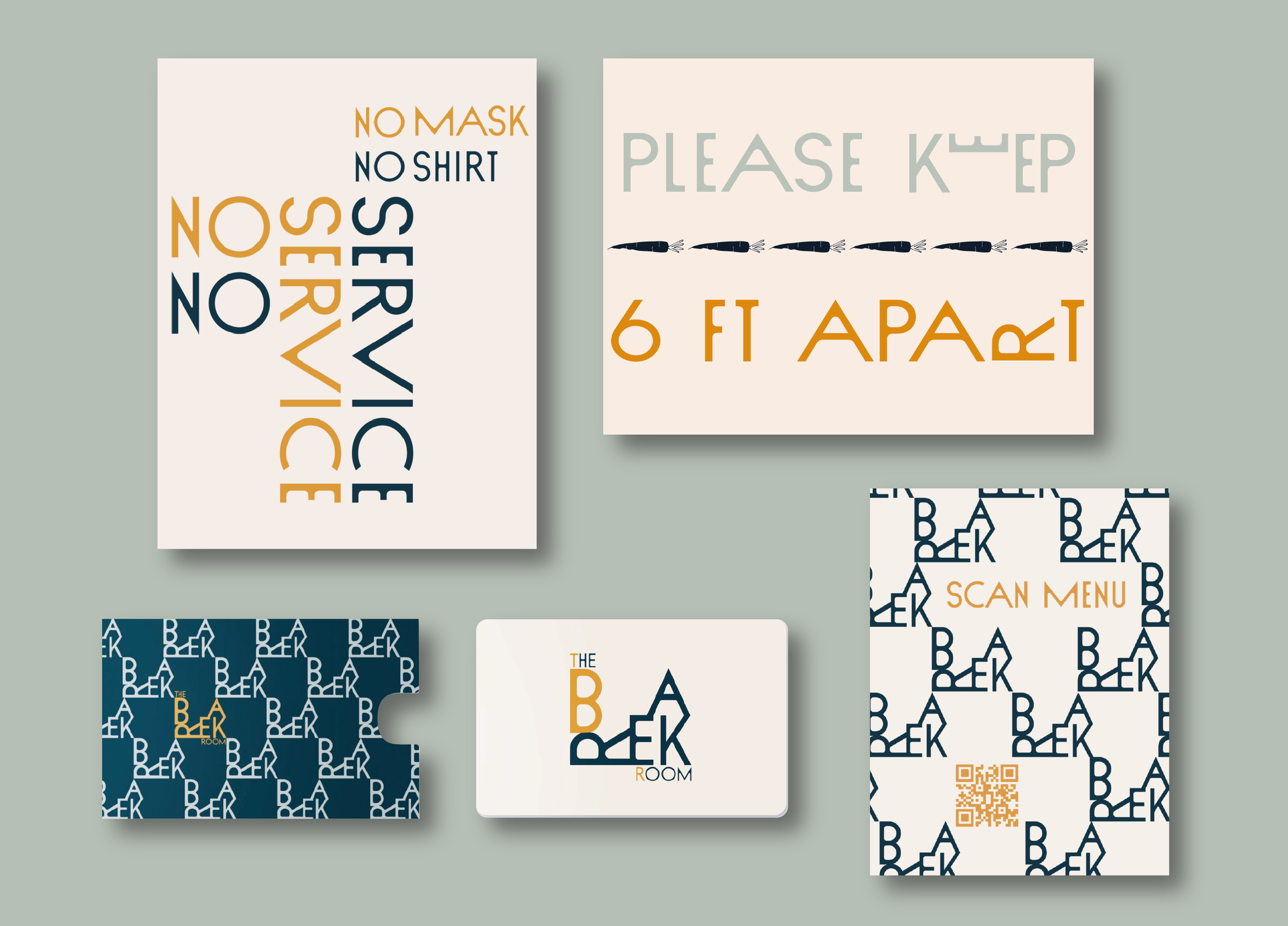
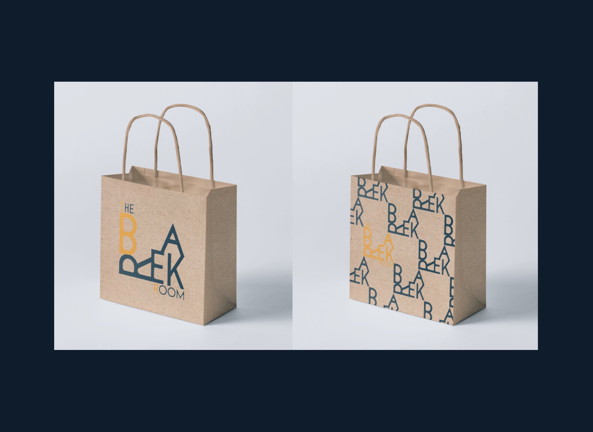
How could we not pay homage to the history and architecture of the mill (and its endless windows) in The Break Room’s logo? The logomark also transforms into a geometric pattern, building upon itself to form systems of interactivity and communalism. Focused on responsibly sourced, sustainably grown, local ingredients, The Break Room serves regional dishes, continuing its investment in the community.


